
Overview
Accessibility is about putting your user first. It’s not only for people with disabilities but is beneficial to all users. Accessibility on the web is also closely related to SEO because a lot of the features that improve accessibility also drive more traffic and improve your SEO.
So, here are the things we are going to talk about today.
- Themes
- Heading Structure
- Hyperlinks
- Alt Text
- Color Contrast
- Plugins
For each category, I’m going to explain how your design decisions affect your users and give a couple examples of what you should and shouldn’t do.
Themes
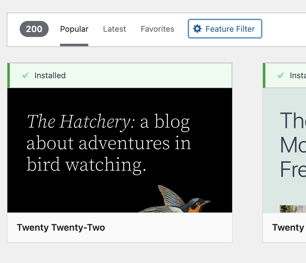
To make your life and the life of your users easier off the bat, install an accessibility-ready theme. Theme designers can request to have their theme reviewed by WordPress and if they pass all the given accessibility requirements, the theme will be marked as accessibility-ready in the theme library. You can search for accessible themes in WordPress by using the feature filter.
Heading Structure
In applications like WordPress when you create a page or post, the title will automatically be formatted as Heading 1 (H1). There should only be one H1 element on each page, therefore when you create headings on your page/post, start with Heading 2 (H2). Any subheadings under H2 should be formatted as H3, and anything under H3 should be formatted as H4, and so forth.
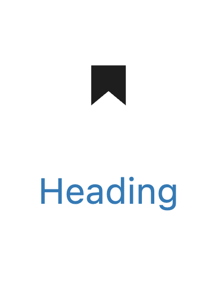
Note that simply bolding heading text and increasing font size is not the same as formatting text as a header. In order for a screen reader to properly parse your headings in WordPress, you must use the Heading block with an appropriate heading level, rather than the Paragraph block.
Similarly, when making bulleted or numbered lists, use the List block rather than just typing numbered lists in a Paragraph block. Don’t use hyphens or other miscellaneous symbols as they won’t be formatted correctly.
Example: WordPress does not recognize the left side as a list.
What not to use to create lists:
– hyphens
– dollar signs
– pluses
What you can use with the List feature:
- Numbered/ Ordered
- Bulleted/ Unordered
Hyperlinks
General Advice
- Open links in the same tab
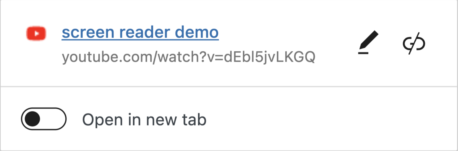
- If you’re forcing the link to open in a new tab, let the user know by adding a parenthesis at the end of the link. Example: Check out this screen reader demo (opens in a new tab).
- Sometimes, WordPress by default makes the links open in a new tab, so double-check by clicking on the link and making sure that the “open in new tab” slider is white instead of blue and the dot is on the left side (See Fig. 1)
- One instance of why you might open a page in a new window is if the user will need to refer to the content of the original page in order to complete a task in another window.
- Nielsen Norman Group has some great info on when and how to open links in new tabs/windows.
- Don’t link to the same page multiple times unless necessary to avoid overwhelming and confusing your audience.
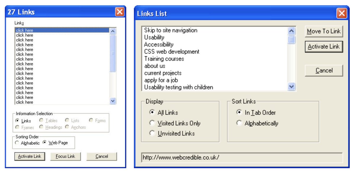
- Duplicate links located on the same page also add redundancy to the link lists created by screen readers, which we will talk about shortly.
- Learn more about when and how to use duplicate links from Nielsen Norman Group.
- Make links large enough so people with dexterity problems and mobile device users are able to click on them. Use the Preview button at the top of your WordPress editor to see what the page looks like on mobile and tablet.
- Indicate that this is a link by using a combination of color and style, such as underline. It’s not enough to convey information using color alone. For example, a link should be both blue and underlined, it is not enough to be just blue or just underlined. Ideally, your links should also be a different color depending on whether they have been opened or not.
Anchor Text / Link Text
“Click here” and naked links are bad for accessibility because the former is not informative and the latter is hard to parse.
So here is some advice on how to write good descriptive anchor text:
- Don’t include the word “link” in your hyperlink text.
- Don’t include the word “here” in your link text either.
- Ask yourself, “What is the destination of that URL?”
- Rephrase your mistakes. To imitate the call to action of a “click here” link, try using “check out”. For example, instead of saying
“To learn more about how screen readers work, click here.”
Say, “Check out this screen reader demo to learn more about how screen readers work”.
If you like using “read more” try describing what the readers should read more about.
For example, “Read more about why prioritizing accessibility is good for your brand.”
SEO
Search engines look at the anchor text other sites use when linking to yours to determine what your site is about. However, since we can’t tell others how to write their link text, let’s focus on your external links aka links that point from your site to other domains.
As search engines have matured, they have started identifying more metrics for determining rankings. One metric that stands out among the rest is link relevancy, or how related the topic of page A is to page B if one links to the other. A highly relevant link can improve the likelihood of both page A and page B ranking for queries related to their topic.
Moz SEO learning center
In other words, by helping another website rank higher, you also help yourself rank higher. By providing descriptive links to other websites, you help search engines better understand others’ content as well as your content. You show that there is a connection between their site and yours.
High-quality pages usually link to other high-quality pages; thus, search engines will look at your content favorably, helping you rank higher.
HubSpot
Alt Text
Alt text, short for alternative text, is an attribute of an image that describes its function or information being conveyed.
Alt text is different from an image caption which serves to add new information about the image that is not already apparent from the surrounding text. If you have both an alt text and a caption they should not be the same — you don’t want a screen reader user to hear the same information twice.
Google uses alt text along with computer vision algorithms and the contents of the page to understand the subject matter of the image.
Google Developers
How to write Alt Text?
Alt text has to be useful, concise, and use appropriate keywords. However, you should avoid filling an alt attribute with a list of keywords aka keyword stuffing. It will not help your SEO and instead result in a negative user experience.
When writing alt text, think about the purpose of your image. Depending on why this image is on your page, you will have to use a different approach to writing your alt text:

Informative images: pictures, photos, and illustrations that represent a concept or convey information. With these images, it is often helpful to include the information represented by the image in the body of the article instead of the alt text if you can. Let’s say you’re writing an article about different cat breeds, and you include a picture of a Munchkin cat. Unless you’re already doing it in your article body, you would want to talk about its physical characteristics in your alt text. If you are including it in your article body, your alt text can just be “a photo of a black and white Munchkin cat.”
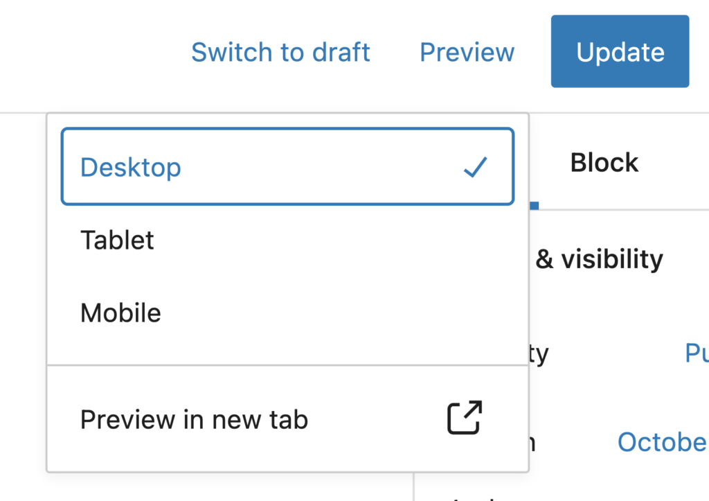
Images of text: A photo or graphic that has readable text inside of it. The alt text should contain all the words you see inside the image. As a rule of thumb, try to avoid text in images that are not logos. Additionally, if you are using a screenshot, you do not actually need to write out every single word, but simply point out what exactly you’re trying to convey with that image. For example, “The Preview button is located at the top right of the screen and to the left of the Update button. The dropdown options are desktop, tablet, mobile, and preview in new tab.”
Complex images such as graphs, charts, and diagrams. To provide equal access to such complex visual information, you have to provide a way for the user to access all the data. For example, sharing an Excel spreadsheet with all the data, or describing all the parts of a Venn diagram. In the case of a Venn diagram, you would include a short alt text that includes the title of the diagram and then a long description of its components in the body of the article itself.

Groups of images: use single alt text for a group of images if they all are used to convey a single piece of information. For example, if you had a star rating, you wouldn’t describe every single star, you would just say it’s a “5-star rating.”
You can use a W3 decision tree to figure out what type of image you have. Also, check out the links for each category; they have some good examples and more detailed info.
Bottom line: think from the perspective of a user who can’t see your image, what do you want them to know about it?
You should not use alt text if your image does not serve any other purpose than to add visual decoration to the page. When you don’t input alt text, the alt text attribute in the code is going to be set to null, so the screen readers know to ignore it.
Color Contrast
High contrast usually refers to a great difference in two colors’ values. In other words, one is very light and the other is very dark. The goal of high-contrast visual design is to make an image or webpage easier to view. Here are two different color contrast checkers you can use:

You can also use the Colorblind Web Page Filter to get a sense of how users with different types of color blindness will see your site, and identify any issues.
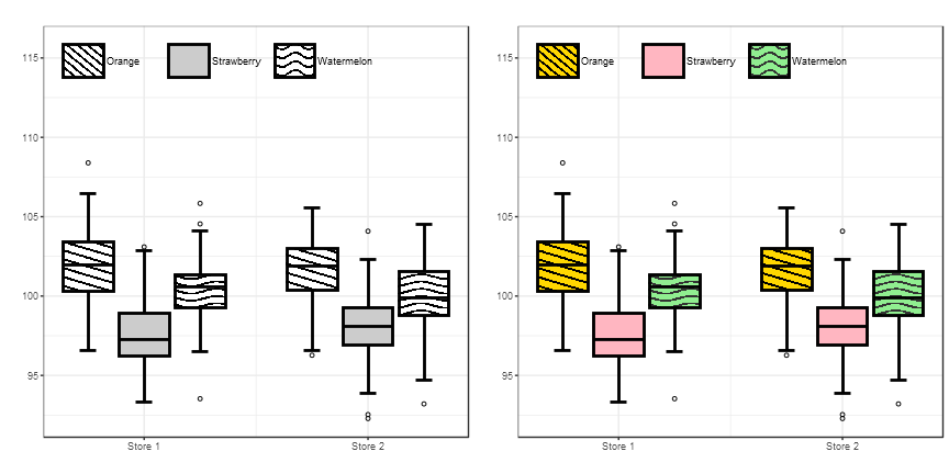
Color alone is not enough to convey meaning, so often we have to use texture or other visual indicators that the content is different.
In the image on the left, because different fruits have different textures, even if the picture is black and white, the user can still tell which box represents what.
Plugins
Plugins are mini software add-ons that enhance the capabilities of a program, in our case, WordPress. One Accessibility plugin we recommend is WP Accessibility.
Additional Resources
Web Accessibility Perspectives – Compilation of 10 Topics/Videos
WAVE Website Accessibility Checker